Wednesday 8 May 2013

Evaluation and Reflection

On reflection to the Print to pixel module I have really learnt a lot, the skills I have gained are going to prove to be very helpful as a designer in the future. I cant say the animation itself was my strong point. I still am not a confident After Effects user however I think that could come with practice. I still believe being in hospital on the introduction week did stunt the rest of the module for me, feeling like I was always playing catch up was difficult.
If I could do the module again I would route right back to the development area and try and really examine the audio more. I struggled with my audio as it was the sound of a wagon/ train which made it hard to not stick to the obvious theme. I don't think I would make my animation so literal if I was to do it again. 

Although I have a lot of improvements on this module I have enjoyed it and bringing in different skills has expanded my thoughts on what area of design I would like to go into.

The Final Animation


Tuesday 7 May 2013

Preparation 

Because my idea changed to a much more hand drawn animation I had to create the set in which I was going to film it, I used chalk to create the background, and I sketched out some little UFO's.  I made three sizes so it appeared that they were disappearing into the background. The Lazar beams at the end and the planet explosion were simply made from card.


After filming!

After filmiing the frames, I then played around in After Effects. I chose the slot of music that I wanted to use and then made the audio go louder when the train tracks start to play, this was to enhance the idea of the UFO coming closer.
I then slowed the frames down as they were far too speedy for the music.


Monday 6 May 2013

Creating animation using hand drawn images.

Here are a couple of experiments I have done using Hand drawn images and taking lots of photographs. 

Sunday 5 May 2013

New Story Board


I thought it was about time I properly planned my animation, and looked into which part of the song I want to use being extremely accurate.
I was told after my feedback from my first story board to keep it simple. To also decide if I wanted to create an abstract, surreal piece or keep a narrative throughout. I decided I wanted to keep a short narrative. 
This storyboard is very similar in the themes of the first one but has been simplified massively. 
I actually prefer this one.


Thursday 2 May 2013

Hand drawn.
A bit of inspiration


I have decided I am going to do a hand drawn animation, using I can animate. It is going to be a narrative with some abstractions within it. Which links massively to my original techniques of using ink and different media to create my first story board. 


I have wanted to stick to the hand drawn/ illustrative theme throughout. Although I am no longer using these images I still like the individual pieces.


Wednesday 1 May 2013

HELP ME DECIDE

After spending a day experimenting with stock motion I am really unsure about what media I want to use for my animation. I seem to be going round in circles. 
I have experimented with clay motion and Hand drawn animation and both seem very make-shift. 
Here are some of the clips I had created today:


Here is a hand drawn experiment that I did.I really like the technique however making the sketches flow throughout proved difficult.


Here is another clay animation I had done.

Saturday 27 April 2013

Using 'I can animate' 

Now I have decided a route I thought it was time to get animating, I used the studio facilities and used the software 'I can animate' This was a good session as I got to know the software. I used play doh to create an animation in which planets are floating in space and then they collide create abstract shapes and different forms with all of the different colours, they then split off at the end to create three solid forms once again.
I like this animation that i created but it still needs tweaking and I am going to continue experimenting. 


As a first attempt on the actual software I do like this animation, however it looks very am-mature in some parts which sometimes looks quite make-shift. 

I am now going to play around with the frames to see what other compositions I can create. 


Thursday 18 April 2013

Feedback.
56% for my storyboard was efficient, I was pleased with my result but after the feedback I received I realised I needed to give it all a much more thorough thought. I needed to be:
REALISTIC
I am no expert at animation, I am no expert at using the software,  I am the opposite, after a few workshops I have come to the conclusion animation is not my strong point so I need to drop the technical After Effects ideas and perhaps stick to a technique that is more playful. After all less is more sometimes. I also need to be more:
INNOVATIVE
After the circumstances at the beginning of the module, what with me missing the first week and then not understanding the brief, I felt I'd rushed my storyboard. Id racked my brains trying to think of some amazingly deep concept when in actual fact I could literally just be more abstract and innovative and let the music lead my animation.

I also need to remember to enjoy this module and answer the brief by responding in my own unique way. So sticking to my abstract space theme, and looking at abstract shapes and collision to the soundtrack I am going to look at using Stock Motion but using clay or hand drawn media instead. This could tone the seriousness of the track down quite a bit, and make the eeriness much more playful. 


Here are some examples I have found, however I am aiming for a less humorous response and using the play dough shapes to create different abstractions. 


Thursday 11 April 2013

Looking at abstract shapes


These short 30 second animations are exactly what I am aiming to creating, particularly the top one, it reminds me of my concept.


These are some small sketches using ink and water of abstract shapes and compositions. I think I am going to focus on the shape of a triangle as it looks very much like shards of glass. 

Tuesday 9 April 2013

Concept
 
I want the story to be about a meteorite colliding into a beautiful abstract planet, At the beginning it shows the abstract planet sitting in the atmosphere. The ghostly way the sound track starts will suit the image well. To then be followed by this meteorite crashing towards the planet and the explosion of shapes. The music will stay on the intro, the eerie, ghostlike noises which will show the abstract shapes blurring through the screen.


Some images iv found on the internet, I like the way the abstract shapes look like they've been created using inks and other medias. Apart from the colours I want to create shapes like these for my animation by experimenting with medias and materials.


Friday 5 April 2013

Change of plan... 
My original three emotive words were:
 Sinister
Soothing
Tranquil 

But instead after some more research I have decided to use:
Empty
Ghostly 
Soothing

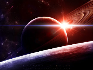
After more research I started looking at science animations about space and planets and the artwork in them was really nice. My soundtrack would suit space well, the ghostlike journey that the wagon seems to be taking and the emptyness throughout the track.


This is an example, I found this on youtube and I really like it. Although my artwork would be more more handmade and abstract.


Some examples.

Thursday 4 April 2013

Stock Motion

I want my animation to be created using stock motion, I want it to be a series of abstract shapes.


MUTO

This is one of my favourite pieces of animation to music, its ambiguous and some bits are quite unusual creating monstrous creatures. The music follows the story of it completely. I am also looking into creating a very abstract animation using patterns and shapes. 


Monday 1 April 2013

Three Words 

The track is an interesting collection of sounds with a distinct sound of a wagon or train on its tracks. I found this sound really quite eerie, whether that was the intention I am not sure however my emotion when listening to it was that it was almost a sound building up to some sinister ending. I used the word soothing because although it is sinister it also has an element of peacefulness. The sounds used together compliment each other and with no huge climax to the piece it carries on at a steady pace creating quite a relaxing atmosphere. However the words sinister and soothing contradict each other but I think this describes the piece well, its a contradiction in emotions. The word tranquil just elaborates on the soothing element. 


Looking at animations I came across Les Triplettes De Belleville, a French animation that uses music and sound more than dialogue to tell the story. This scene in particular is about a woman who goes on a journey to find her lost son and is under a bridge. The sounds of things in the background are barges and ships and boats but the focus is about her feeling quite alone. This reminded of my sound track, the wagon in the distance is similar to this scene. 

Thursday 21 March 2013

Print to Pixel 
El Divisadero 
Chris Watson 


Starting this project was extremely challenging as I missed the whole first week of induction workshops and lectures because of being ill and in hospital. So catching up over Easter was really difficult. But after emailing and asking peers I soon understood the brief as best as I could and jumped straight in by listening to my piece of music, A LOT. 
The piece I got was very eerie, it provoked a very 'horror movie' atmosphere with a wagon rolling on its tracks and the slow noises floating in the background. It was creepy and dark when I listened to it.
I started to jot down some general words that described what I could hear and some of the emotions it provoked.


Although it was eerie and I found it sinister there was also something quite soothing about it. Like the sort of sounds you'd hear in a day spa or on them machines that play music to send you to sleep. There was definitely a therapeutic aspect to the music track.  

After watching some YouTube videos I found a documentary, It is Christ Watson explaining his process when creating his tracks. It explains how this is an art form and he uses mostly natural sounds by going out travelling with his equipment to various locations and focusing on sounds. 


Tuesday 12 March 2013

Illness Strikes
Happens to us all from time to time

Just a quick blog update to say how I unfortunately missed the assessment because of being rushed to hospital. I am still waiting on information on when I will be able to present my work and receive feedback and it be assessed. 

Thursday 7 March 2013

The Final Package


My package was all hand made, using brown recycled card. All the typography and imagery was all hand done. This really links in with my original ideas and inspiration. Using a very organic and natural theme to create a package that reflects me. 


Tuesday 5 March 2013

My Design

Net


I still wasn't sure at this point what imagery was going to be on y final package, I like the idea of a tree showing the growth of my design skills and the hand drawn mythography however I still wasn't sure if this was what I wanted my final package to look like. 


These are just some sketched I made of the final package to show and finalise the shape and image of it as well as the final logo.


Saturday 2 March 2013

Final packaging ideas
Bit of a collection of inspiration for my final package


Tuesday 26 February 2013

The Concept. 

As I am yet to find out what area of design I want to go into I had an idea to use my package to simply express the fact that I am forever growing as a designer. I then had to think of ways to present this. I thought of using an illustration of a tree as a metaphor of my growth. I then thought  how well this would go with my organic theme, having the final made from brown card with an illustration of a tree would look quite delicate.

This is a sketch I made from a journal I kept, I think this represents me better than anything. It's simple, delicate and looks asif its trying hard to grow, all the branches are almost like all of the paths I could possibly take. 


I also was thinking of added some text to the package, again I wanted it to be as simple as;
'Forever growing as a designer'


Thursday 7 February 2013


A package design that reflects you as a designer?
I have been looking at nets and even using this as an oppurtunity to practice my own drawing skills however I couldn't decide what/how I could reflect myself as a designer, I am yet to find out if I am a Typographer, Photographer, Packaging Designer, Advertiser, Web Designer... I really don't know. 
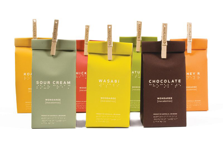
However I do know that through research I was inspired by Origami, the beautiful art of it and some of the impressive pieces I found were really intreging. I also was inspired by the use of packages that were created with a 'green' ethic. The use of brown card for a package was a very nice touch, the use of using natural elements like string to perhaps attach the package lid together. 


This is my package design, I want to have it created using brown card, I want my logo to be on one of the faces and on the back I want to have some typography. 

Laser cutting session

I am not a fan of technology, in the sense that for me it takes quite some time for me to understand how to use a programme/software comfortably. So Illustrator is not at the top of my 'favourite pass times' list. However I am persevering. The laser cutting session was very helpful, I had never used this method before and it definitely made me more comfortable around the idea. Here is what I created.


Looking at Origami. 

I have been designing my package with some simple sketches, looking at basic pyramid shapes and cube structures but what has really inspired me is the idea of the package being very practical with as little waste material as possible. I have been looking and experimenting with card by using origami as a way in which I can see different structures being created. 


This swan was not me own creation, I wish i could take credit for it but I can not make something as nice as this however I asked my friend to create it to again explore forms.